
7 Tips For Increasing Contact Form Engagement
Does your contact form call out to visitors, convincing them to enter text and click the friendly button beneath the fields? Or does it create a barren wasteland on your website, an empty page visited only by spambots?
In a previous post, we discussed 4 Reasons to Use a Contact Form On Your Website. This post will follow up by exploring some of the best practices for encouraging user responses.
Despite the mass introduction of livechat software as well as chatbots to many websites, contact forms remain a staple of the modern online experience, being expected and used by many website visitors. But just having a form is not enough. If your form isn’t optimized for quality submissions, it may hinder rather than help.
1. Keep Your Forms Short
Multiple studies have indicated that having fewer form fields relates directly to higher conversion rates. One option is to just strip your form down to the basics: name, email address, and message. Although this may seem overly simple and non specialized (and it is), that simplicity and familiarity can make the form more appealing to some people.
The fewer fields you have, and the more specific the requirements for those fields are, the more likely you are to receive valuable visitor input.
2. Use an Appealing Layout
If your form requires a larger number of fields, group them in a logical sequence and make sure they all relate to the reason for submission. According to Smashing Magazine, it’s also ideal to keep form elements in a single column - and to further benefit desktop users, each field should be easily cycled to from the previous one using the TAB button. That's why using one of the 6 Best WordPress Contact Form Plugins or a comparable resource is important.
3. Ask Questions That Value Visitor Contribution
Depending on your website and your goals , forms can take many shapes and sizes, but they will always have common characteristics. Questions that value the visitor’s experience will make them more likely to come back and continue engaging with your website, even if you never respond to their submission (though you should!).
For example, one way to spruce up the classic “name, email, message” form would be to add a fourth field with a relevant survey question. This would serve the dual purpose of engaging the user and providing you with valuable information.
These questions could include asking how they found the site, what they like most or think needs the most improvement, or even their overall satisfaction rating.
As an extra tip, remember to keep your intentions and requirements clear. If someone is confused about the information you’re asking for, they either won’t submit the form, or may end up submitting the wrong information.
If you need more inspiration, take a look at these Examples of Good Feedback Form Questions, provided by AidaForm.
4. Use Multiple Steps to Break Up Longer Forms
In addition to grouping fields into logical sequences, you can break up longer forms by using a multi-step process. This is a tactic used by some e-commerce stores that require a lot of information - for example, a new customer filling out their shipping information. Rather than slap the customer with a 20-field form to fill out all at once, they’ll ask for name and email, then move them to a new page for the payment gateway and other personal information.
Not only do multiple step forms increase the likelihood of engagement, but they also give you a chance to collect the visitor’s email address right away. This can then be used to send a follow up, such as an abandoned cart notice if a customer fails to complete a purchase.
If you’re not sure where to draw the line, aim to keep the number of fields per form-step under 6, but make sure you keep them all logically grouped.
5. Implement Streamlined Spam Protection
Although spambots have evolved at a mind-boggling rate, methods of preventing form spam have just about kept up with them. There are a number of different types of software which can be used to prevent spambots from completing your form. This type of program is referred to as a “CAPTCHA,” and it typically provides some type of challenge or trap for bots. These range from simple mathematical captchas, to difficult-to-read graphics that then require that you type out barely distinguishable characters. However, many of them are time-consuming, visually unappealing, and annoying enough to discourage most people from filling them out.
Fortunately, there are several modern options that can be used in combination. Google’s Recaptcha is an excellent choice, which involves simply placing a checkbox at the bottom of the form. Checking the box confirms that the visitor “is not a robot”, and they’re free to send their data off to your database or email. To learn more about Recaptcha, check out How to Add CAPTCHA to WordPress Contact Forms.
Google has also introduced an Invisible Recaptcha, which detects bots based on their behavior and interaction with the website, blocking them before they have a chance to send you any information.
Another invisible means of controlling form spam is “the honeypot.” A honeypot in this case refers to an invisible field or fields which humans cannot see, but which bots will instinctively interact with. If the honeypot field is filled out, the form will not submit. Because they don’t interrupt the user experience at all, honeypots can be ideal, but unfortunately more sophisticated bots can be programmed to work around them.
6. Don’t Use a “Submit” Button
According to a Hubspot Study, actually using the word “submit” on your submit button can hurt your form’s conversion rate. The same study found that simpler calls to action, such as “click here” and “go,” were the most effective for encouraging completed submissions.
My personal preference for CTAs on contact forms is to make them relevant to the action the user is taking. On my website’s form , the button says “Send Message” because that’s the only purpose behind the form. If I were accepting job applications through the form, I might use a button text that said “upload application,” or something similar.
If you’re using a form to unlock a content upgrade (whether paid or as a lead capture), using “learn more” as a call to action has proven to be a powerful option throughplatforms such as Facebook advertising and email marketing.
7. Remember to Be On-Brand and Creative
At the end of the day, one of the strongest deciding factors for form submission is going to be the text you attach to it. If it rings true with the brand voice your visitor has become familiar with, and it evokes a sense of curiosity or humor, filling out your form will feel like a breeze even if it contains multiple steps and many fields. On the other hand, if your contact form is flat and boring, or difficult to navigate, most people will decide they have better things to do with their time.
Now that you know how to make your contact form engaging, you should also know how to make it secure. Check out part 3 of our 4-part contact form series: How to Add CAPTCHA to WordPress Contact Forms.
 About the author: Alex Tucker
Alex is a writer and digital marketer operating out of Ontario, Canada. He's passionate about health and wellness, self defense, and creating WordPress websites.
See all articles from this author Interested in writing for Web Hosting Canada?
Also on the WHC Blog

What Is Website Performance and Why Is It Important?
Website performance can be a maze of buzzwords, but it really boils down to one thing. Have you ever visited a website that loaded slowly (or incorrectly) to the extent that you immediately navigated away? If so, you’ve...
Read full article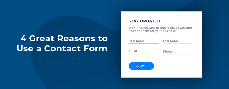
4 Great Reasons to Use a Contact Form on Your Website
If you’ve ever visited a website with a contact page, you may have noticed that some use forms to initiate first contact whereas others simply display their email address for you to reach out. While simply displaying your...
Read full article